Creating a multi-faceted bond between advisor and investor.
Challenge
Lido is a national wealth advisory firm from Los Angeles, California with offices throughout the United States. Their clients love them, but their public presence was dated, corporate, undifferentiated and, more importantly, not reflective of what makes them awesome. In an effort to increase leads and awareness, Lido originally came to us ready to do an ad campaign, but we suggested they refresh their brand first.
Insight
You don’t go knocking on doors before you have the right pitch and the best outfit. So, how should Lido verbally and visually express themselves to have a strong, bold, ambitious brand when they go more broadly out into the world? The more we learned about Lido, the more we learned how many hats they wear to grow and protect what people have earned—wealth planner, financial educator, problem solver, family therapist, an easy button for wealth and life, your first call, the list goes on. And on.
Solution
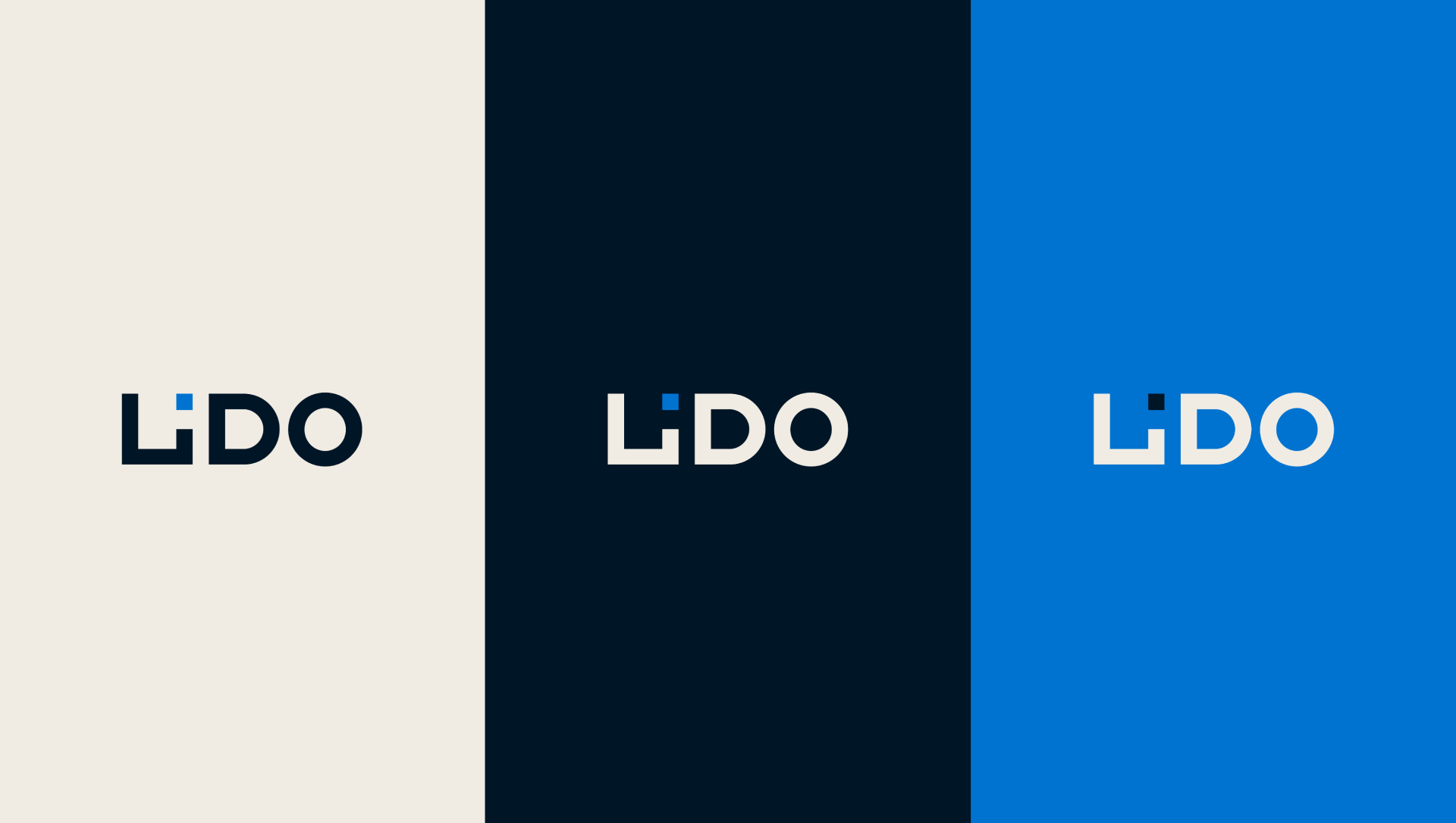
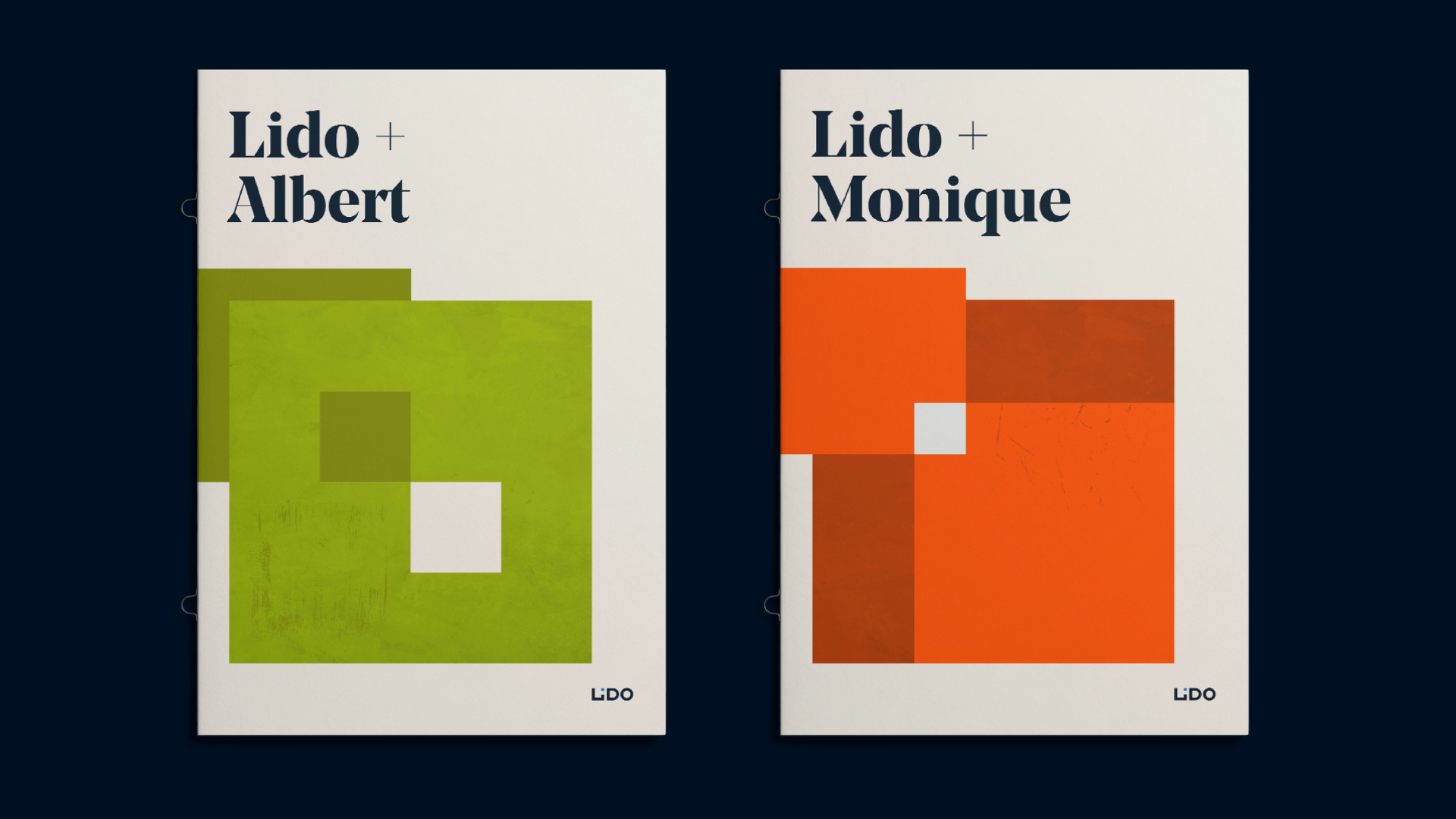
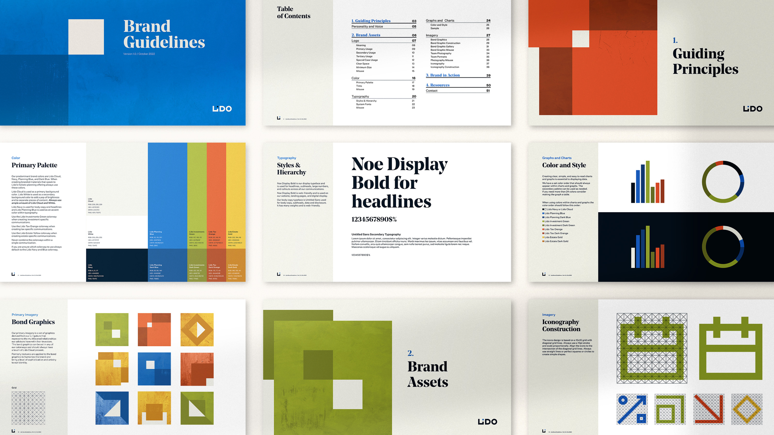
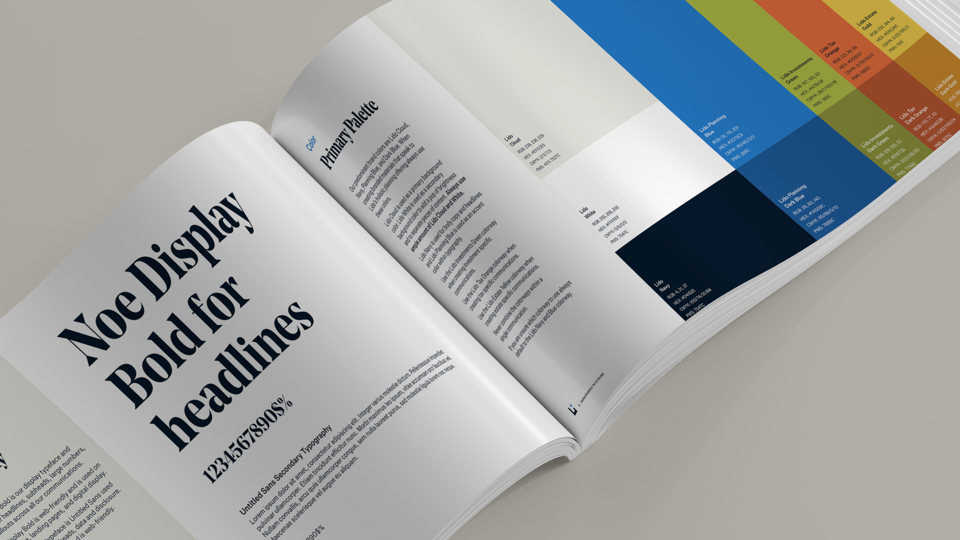
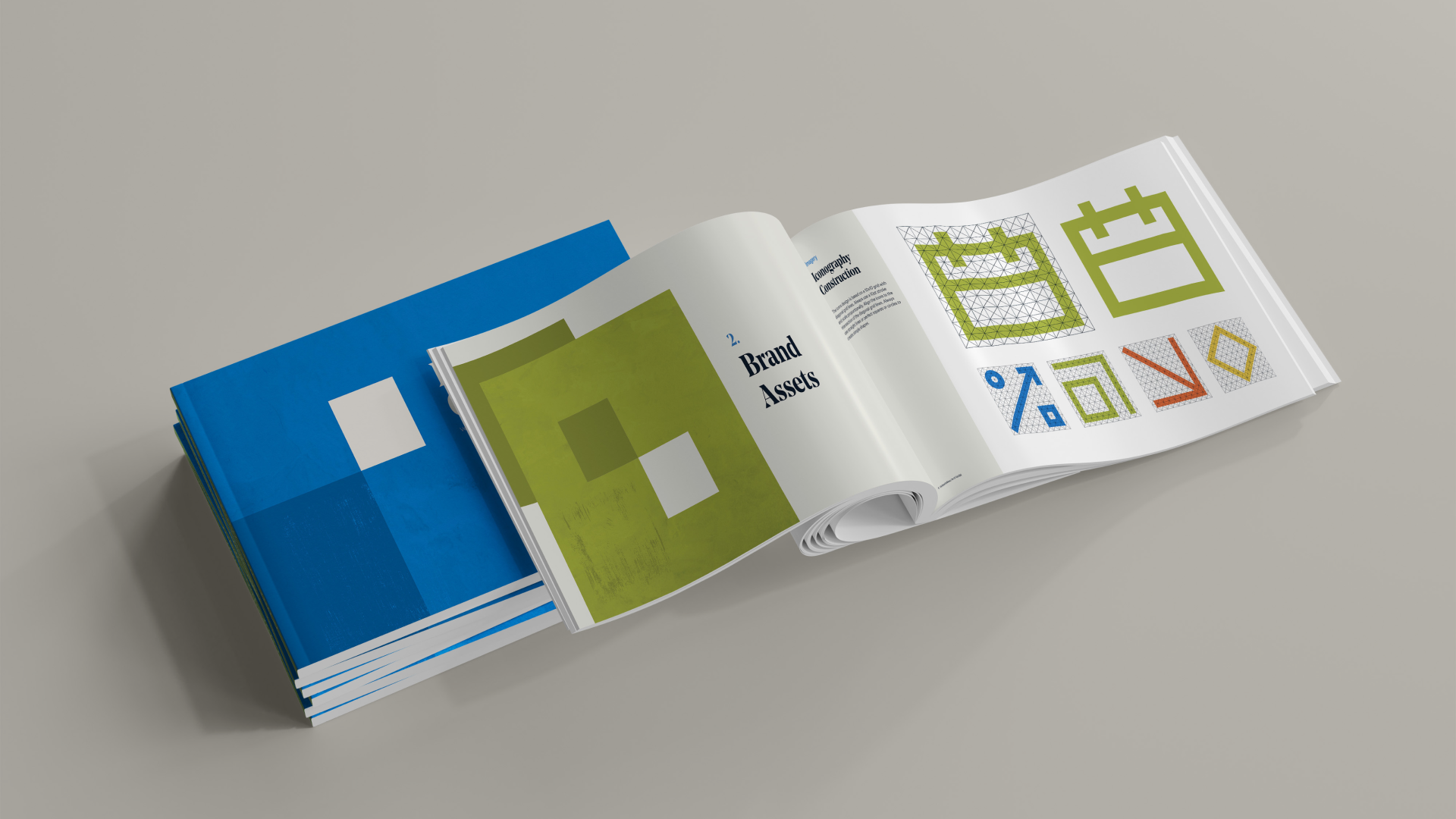
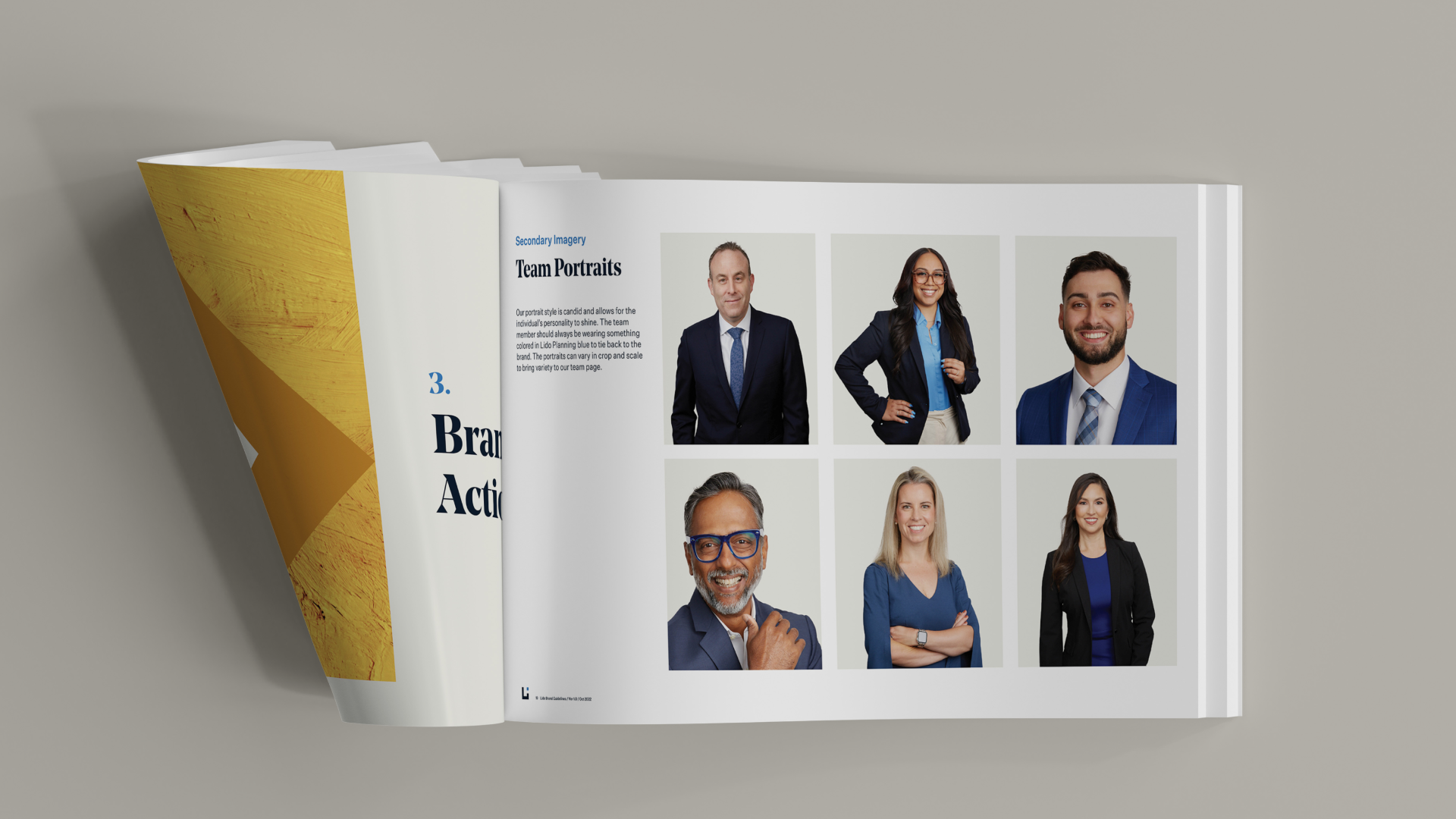
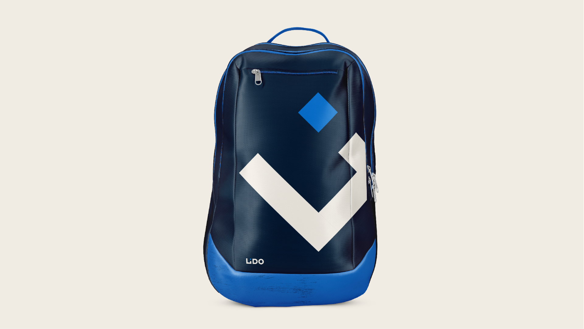
The many dimensions of Lido creates such a strong bond between Lido and the investor. This became the core of the brand, both verbally and visually. The logo is based on that bond. The broader identity highlights the many sides of Lido and the various shapes Lido relationships take on. Ultimately, we created a unique verbal and visual language for Lido that feels like Lido, humanizing the brand and differentiating it from competitors.